Full site vs mobile site
Project
User Experience Professionals Association (UXPA) International recently updated its website and needed recommendations on how to update the mobile site's navigation menu (www.uxpa.org). This individual project was an expert review of the UXPA mobile site.
Client: UXPA International
Project Type: Individual Project
Duration: March - May 2014
Method & Deliverable: Expert Review
Tool: Apple Keynote
Process
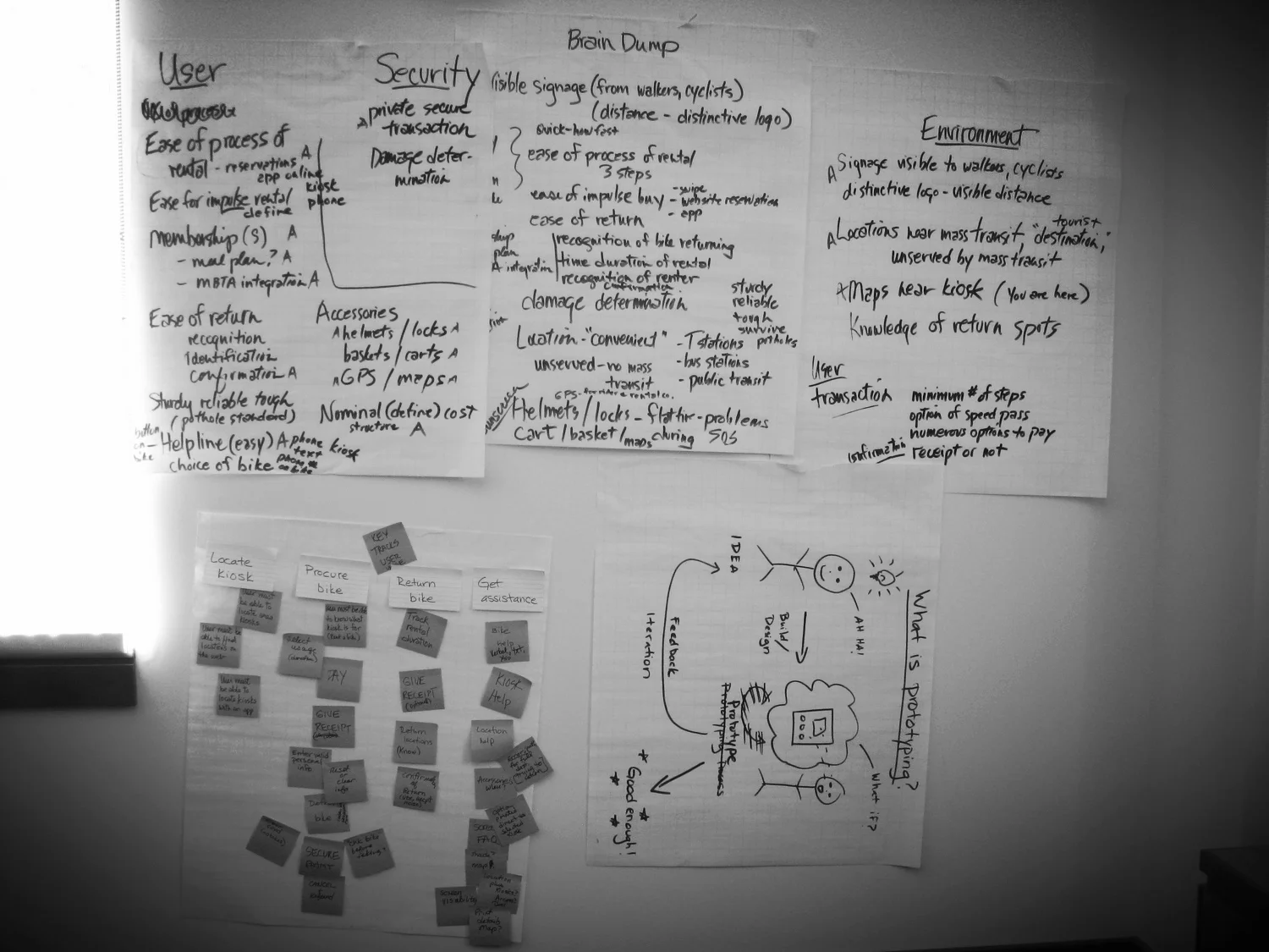
Goals. Before starting the review, I noted UXPA's mission and goals to understand which areas are important to the organization. Therefore, these areas should be reflective in UXPA's site.
Research. I compared the full site's and mobile site's navigation menus and they were significantly different from each other. As I was reviewing the menus, I also discovered that the content of many pages were different between the full and mobile sites. Also, I found additional issues with the sites, such as the implementation of the mobile site menu and accessing the site with touchscreen tablets.
Expert Review. I organized my findings (strengths and weaknesses) and depicted them visually using site maps, tables, and step-by-step figures. To demonstrate my recommendations for the mobile site menu, I mapped specific pages to UXPA's goals.
Site maps of full and mobile sites
Mobile site navigation issue
Mapping goals to pages
Result
Outcome. I documented my review and recommendations in Apple Keynote and sent a PDF version of the presentation to the UXPA Web Committee Lead.
Lessons Learned.
Discovering additional findings increases effort required to complete the review.
Ask lead if UXPA is aware of other site issues before spending additional time analyzing them.
